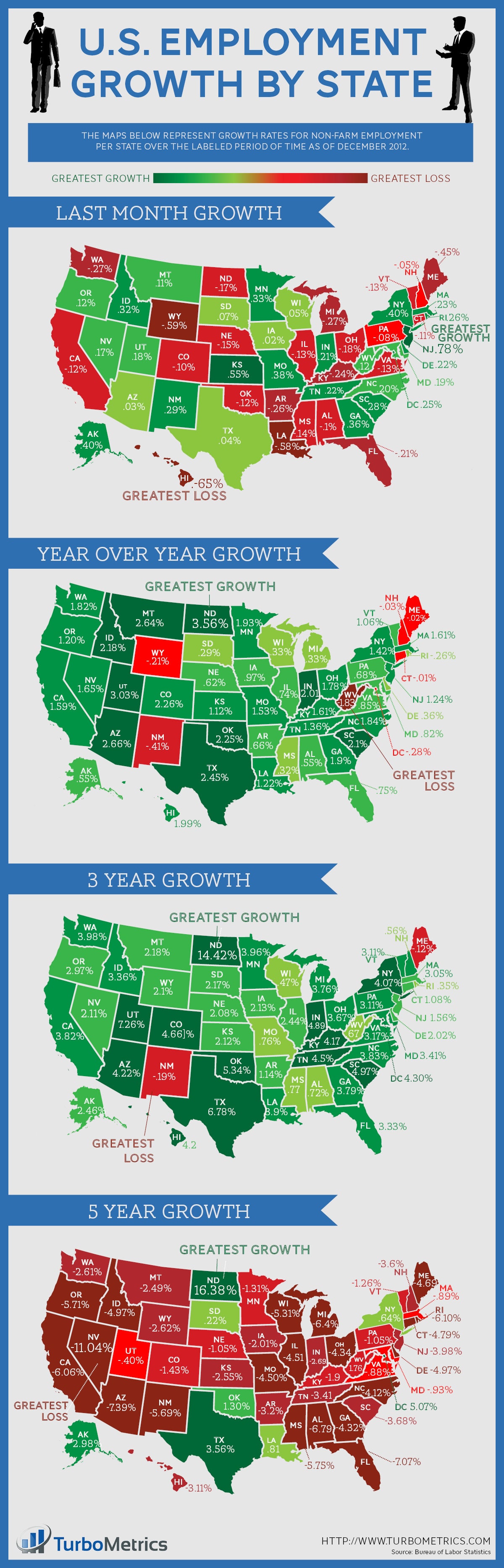
Here is the December 2012 edition of our employment growth trends data. If you’d like to access more data like this, complete with interactive charts and graphs for every state, MSA, and county in the United States, sign up now for a free trial.
Here is the December 2012 edition of our employment growth trends data. If you’d like to access more data like this, complete with interactive charts and graphs for every state, MSA, and county in the United States, sign up now for a free trial.